Unified Luxury E-Commerce Platform
Unifying three heritage brands across global markets — into one seamless luxury digital home.



OVERVIEW
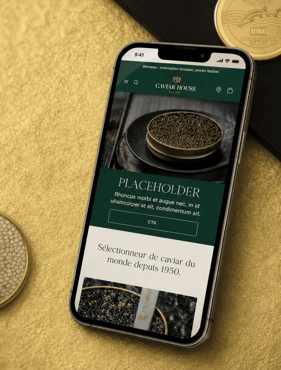
Caviar House is a Parisian institution with over 75 years of expertise in premium seafood — and the parent company of two prestigious houses: Prunier (fine caviar, France) and Balik (artisanal smoked salmon, Switzerland).
With ambitions to unify their digital presence across all three brands, they needed a complete website redesign — one that could finally match the world-class quality of their products.
Working within a team of 2 designers, 1 developer, and 1 PM, I contributed to the full redesign — from design system to final high-fidelity screens across all key pages.
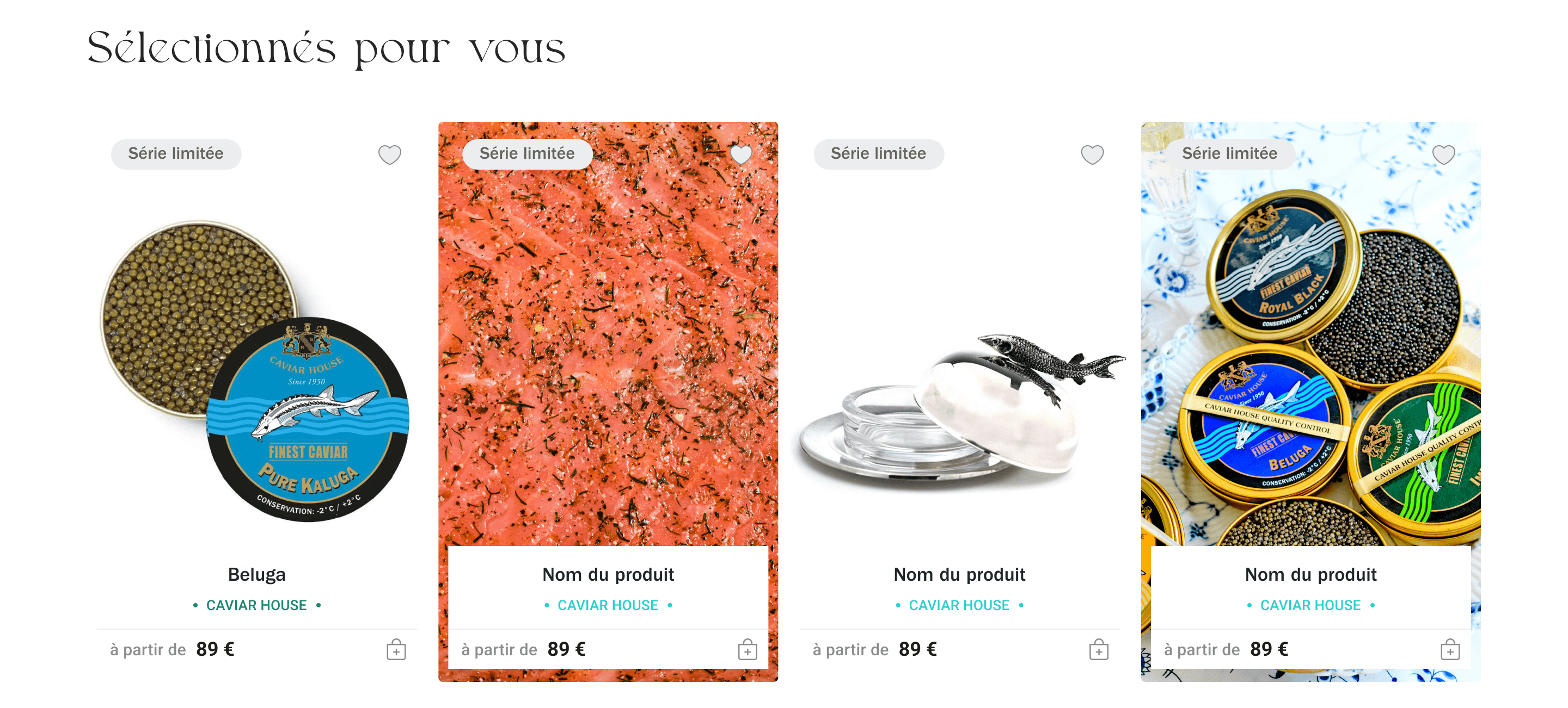
Selected deliverables covered in this case study — Homepage · Category Page · Product Page
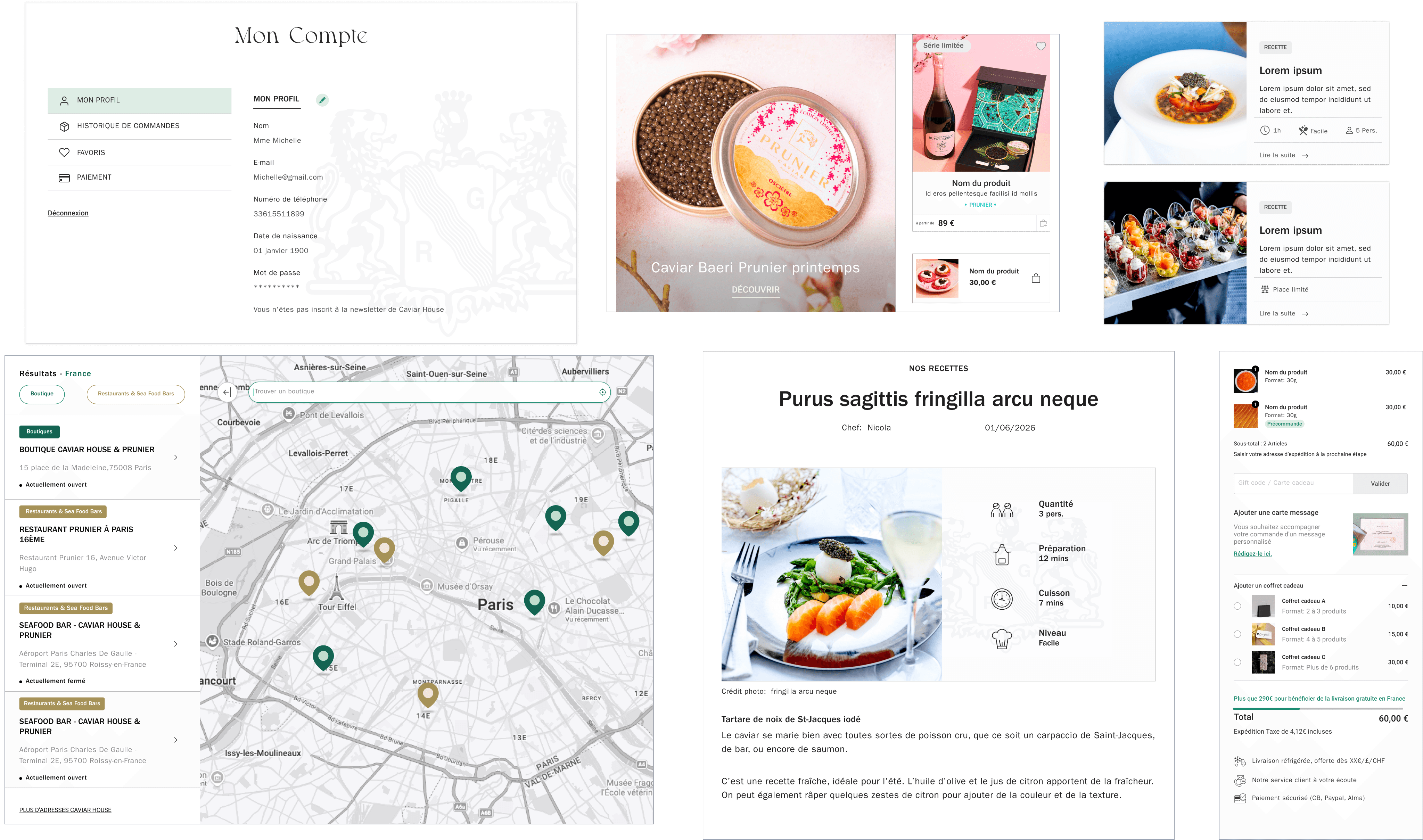
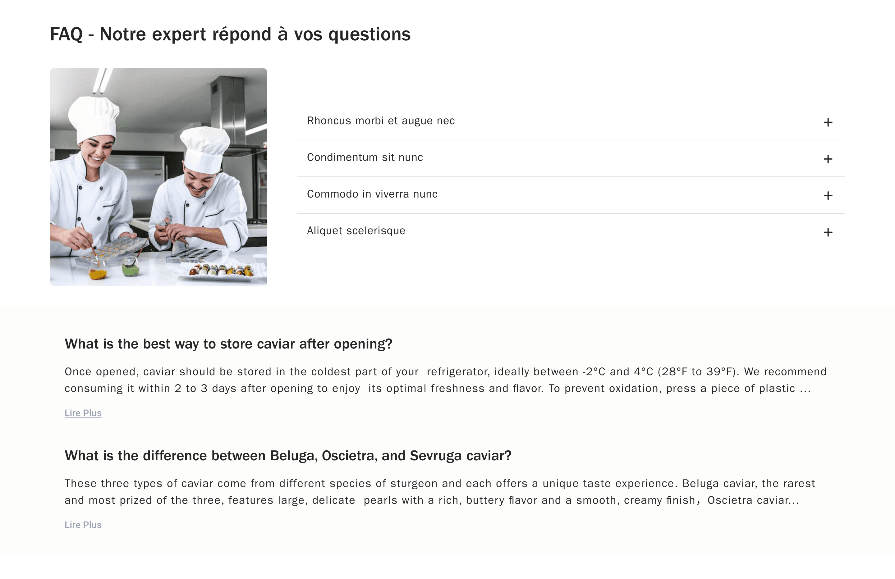
Additional pages: Checkout · Brand Story · Store Locator · FAQ
WHAT WE FOUND
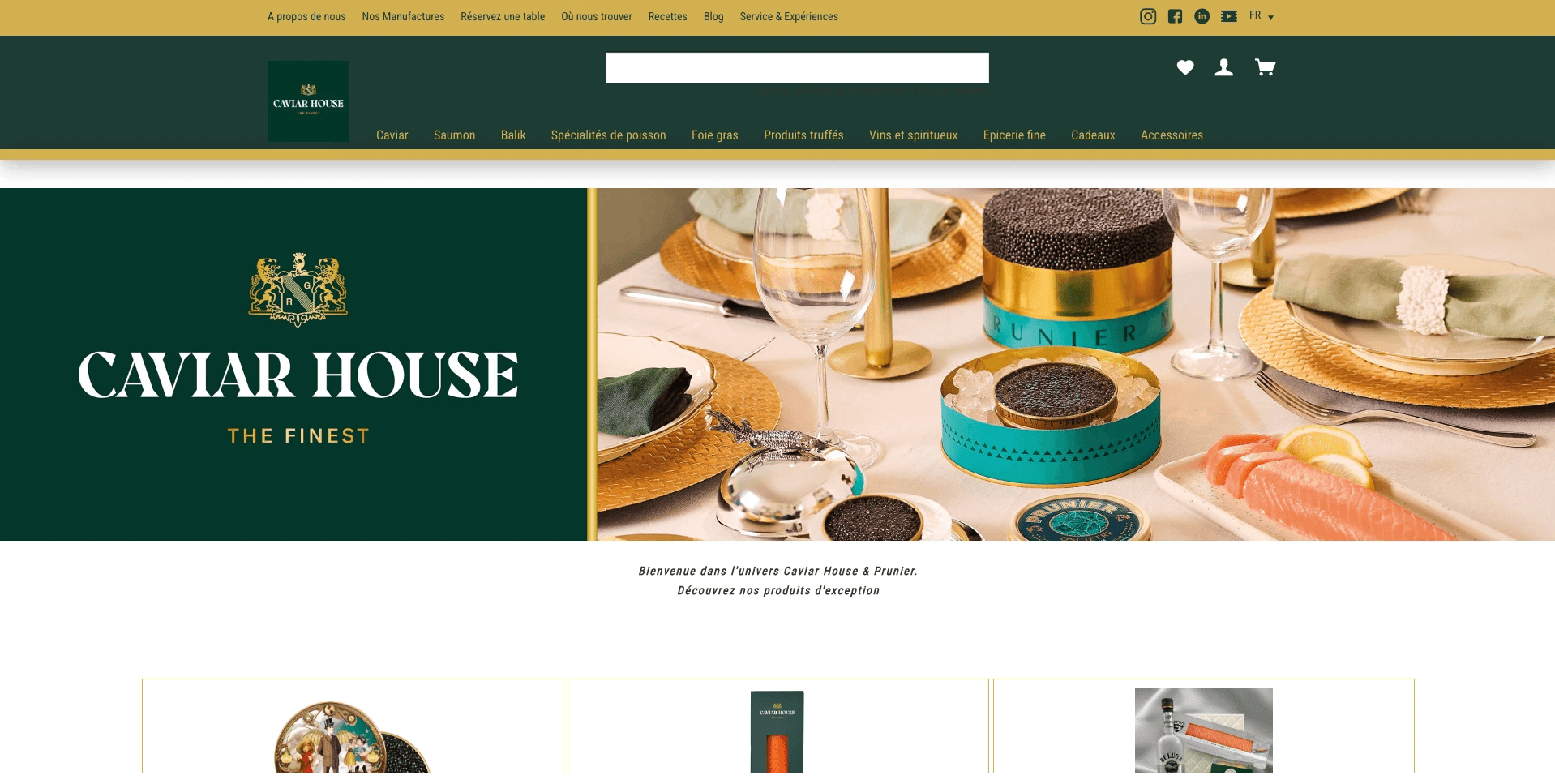
Landing page
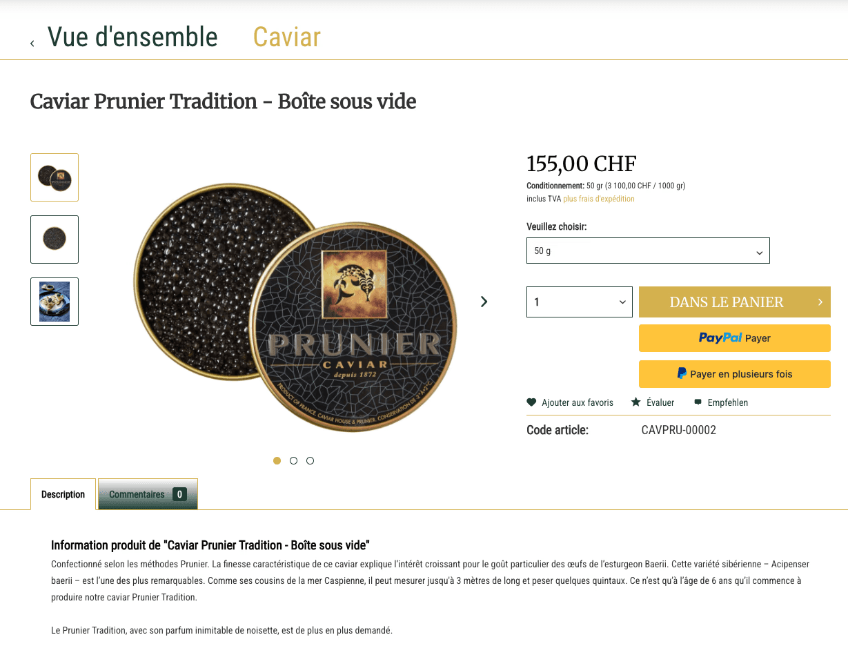
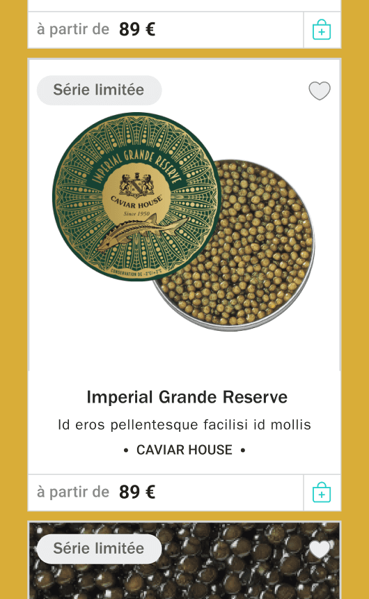
Product page
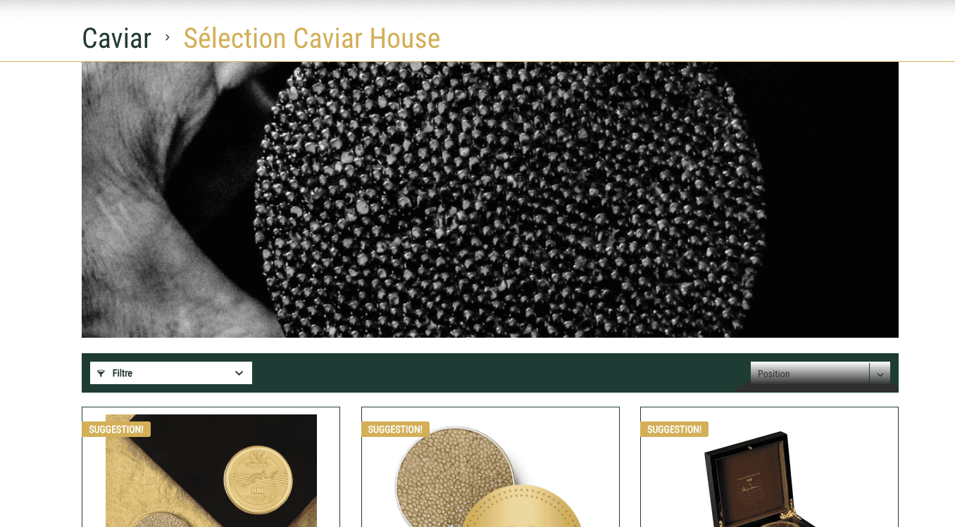
Category Page
CHALLENGE
How might we redesign the Caviar House digital experience to reflect the brand's luxury positioning — while creating a clear, intuitive journey that guides users from first impression to confident purchase?
GOALS
01
Establishing a clear content hierarchy so that users can effortlessly find what they're looking for.
02
Building brand credibility and making users feel confident in every purchase.
03
Communicating Brand Identity Through Visual Languag
SOLUTION
The client had an existing website, but with no Figma files or design assets to work from, we were given full creative ownership to rebuild the Caviar House digital experience entirely from scratch.
First Impression - Landing page
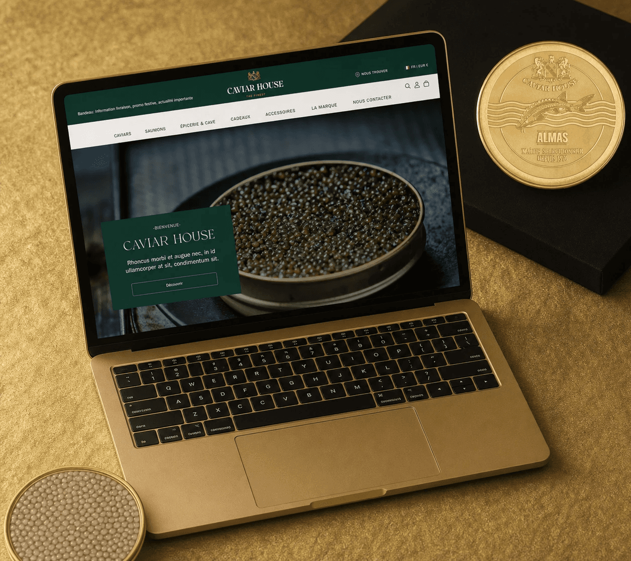
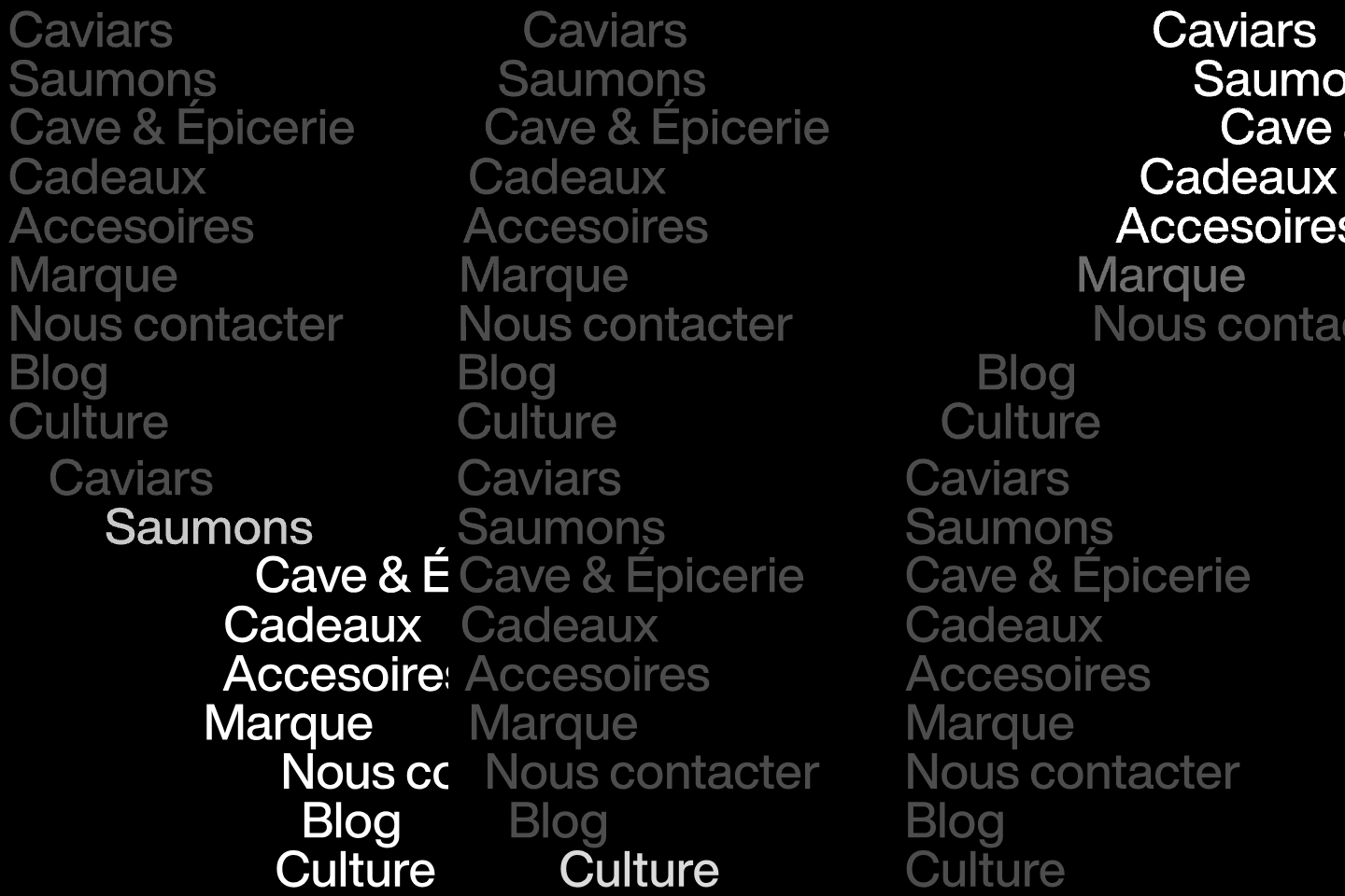
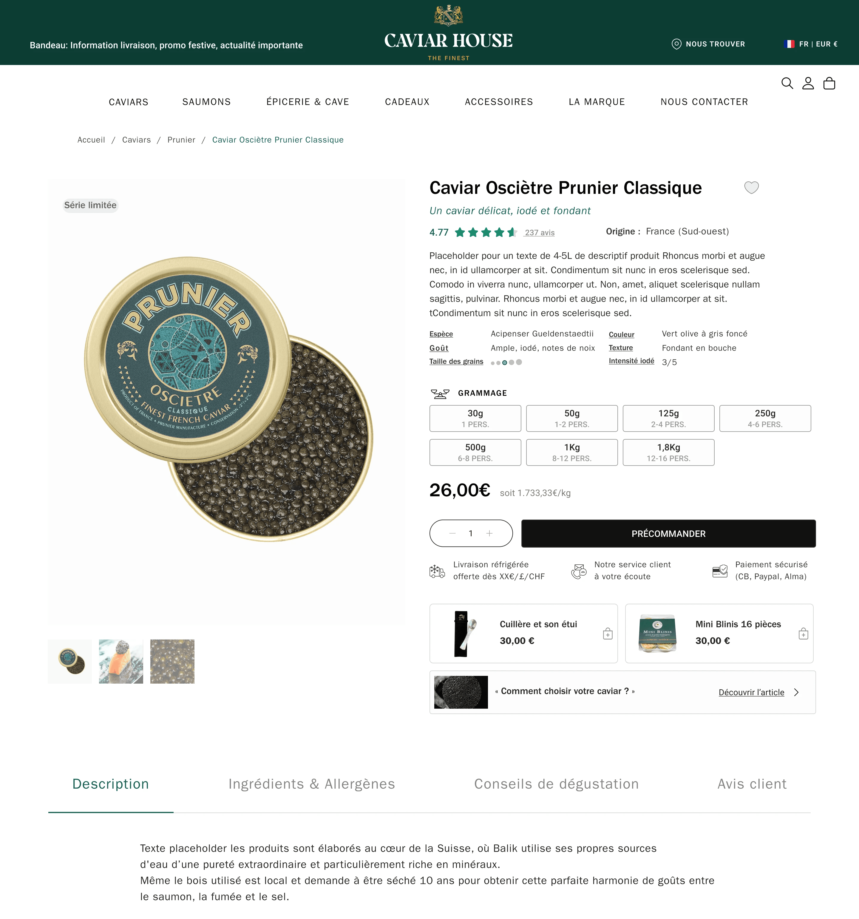
We started by rebuilding the header — consolidating 10+ scattered navigation items into a clean, minimal bar with clear hierarchy.
Below it: full-screen visual, one statement, one button. No noise.
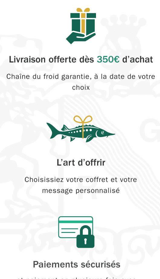
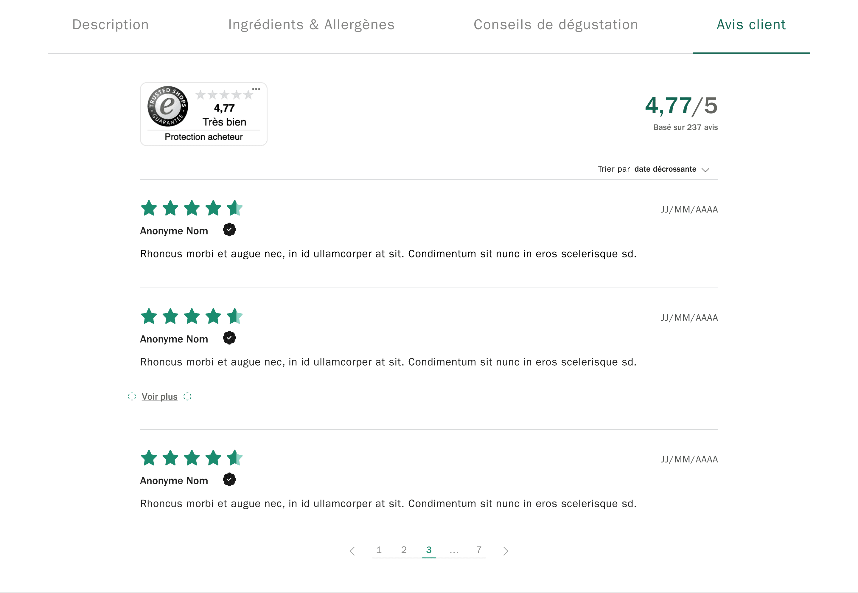
Trust is built through customer reviews, store locations, and a consistent visual identity.
What I Learned
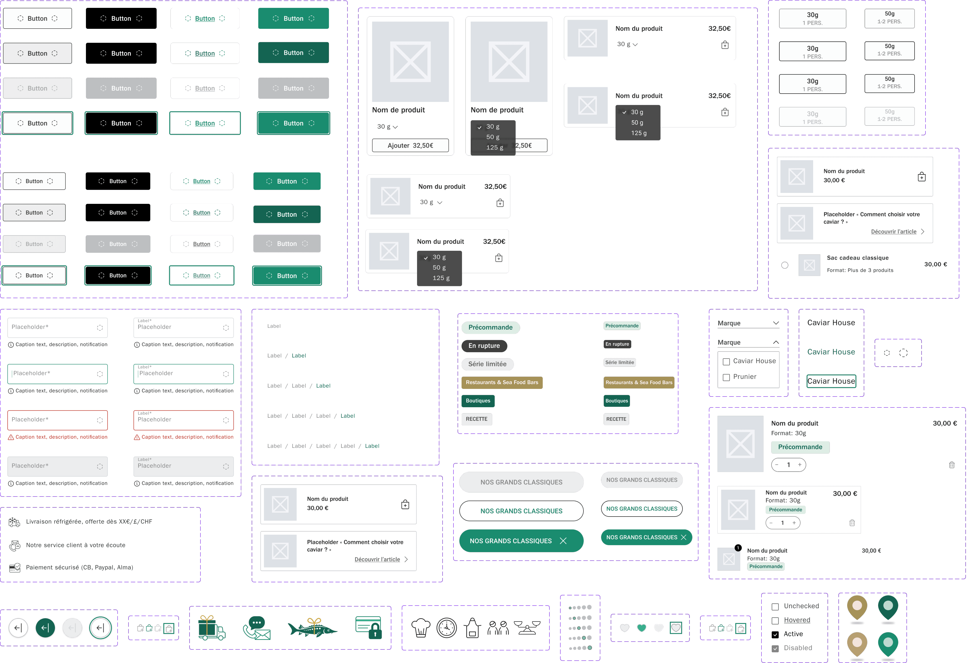
Building a design system before touching a single page felt slow at first. But every decision we made upstream saved us three downstream.
Structuring complex information taught me that hierarchy is not about what looks good — it's about what the user needs to understand first, second, and third.
And details matter. Not as decoration, but as trust. A missing return policy, an unclear size guide, an inconsistent button state — in premium e-commerce, small friction kills conversion.